Overview
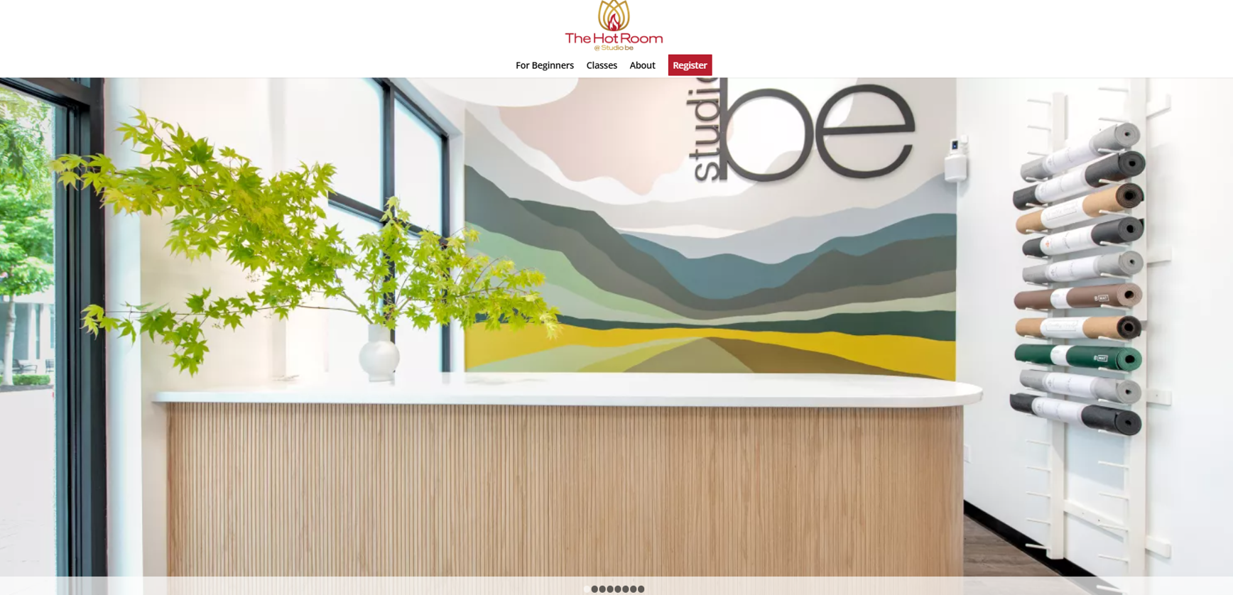
The original website shows a very dated design style, with rigid, boxy layouts and heavy horizontal sections typical of websites built over 10 years ago. The structure feels static, with squared content blocks and limited use of white space, making the page look crowded and less inviting.
Key actions like class registration and schedules are present, but they are not visually prioritized, which makes it harder for users to quickly understand what to do next.
Overall, the site focuses more on basic functionality than on modern user experience, branding, or mobile usability.
Result
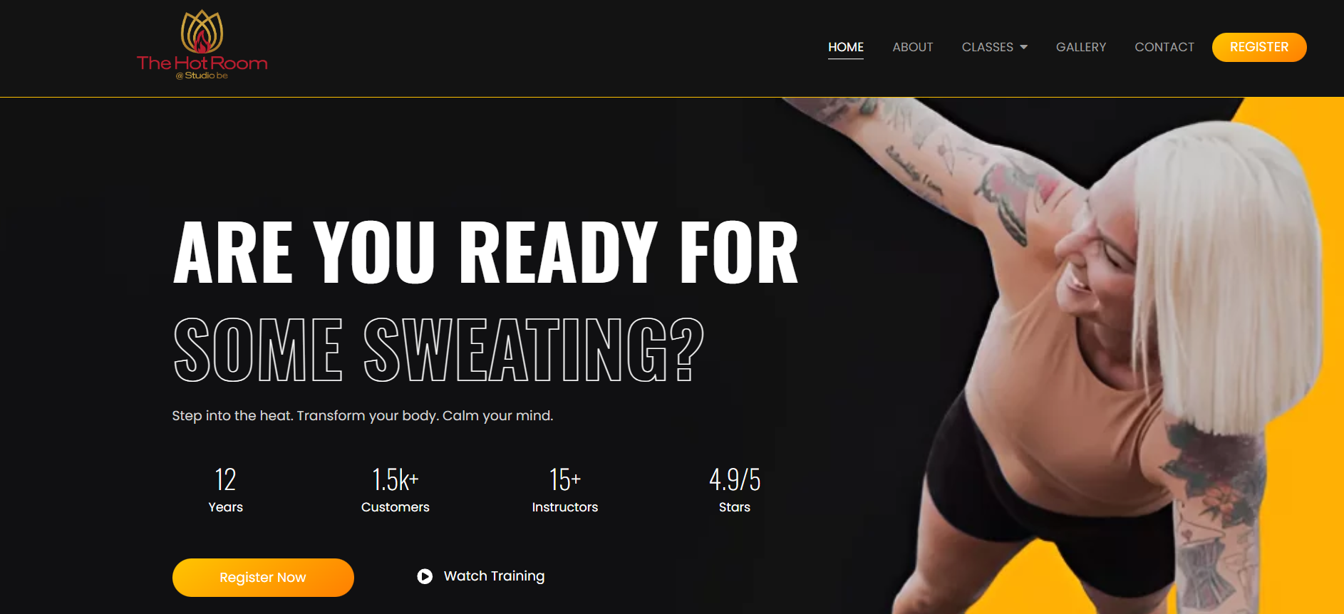
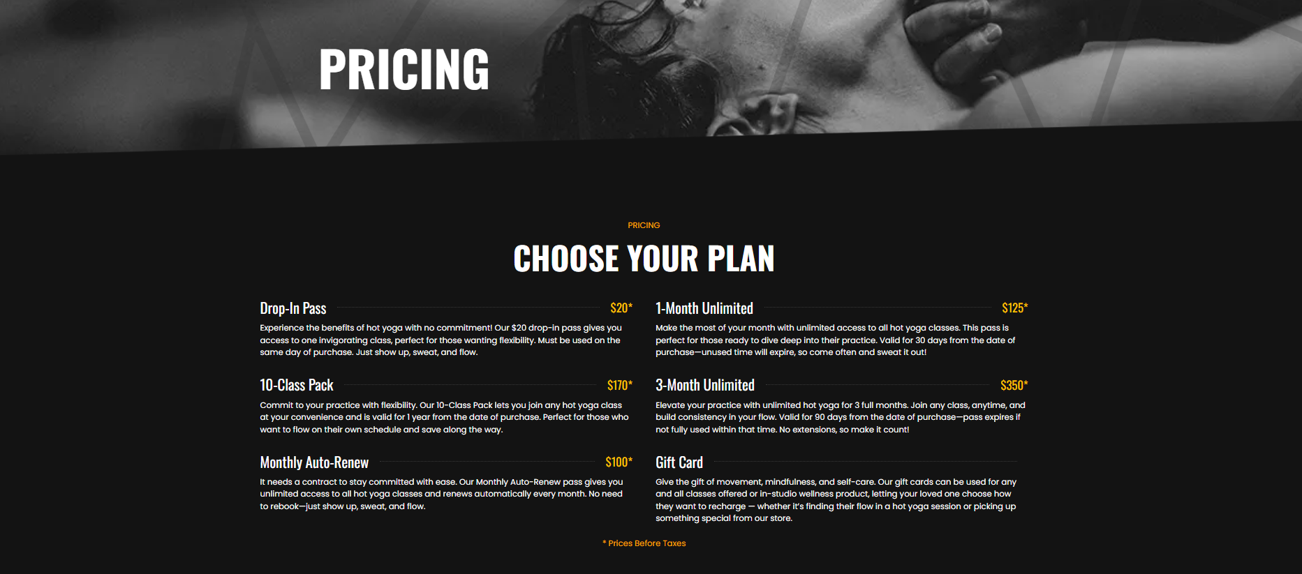
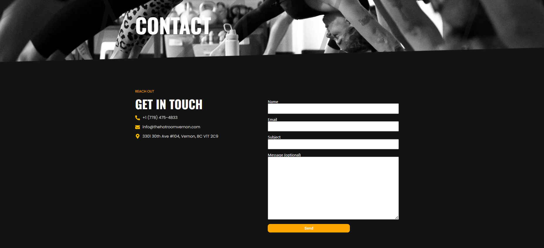
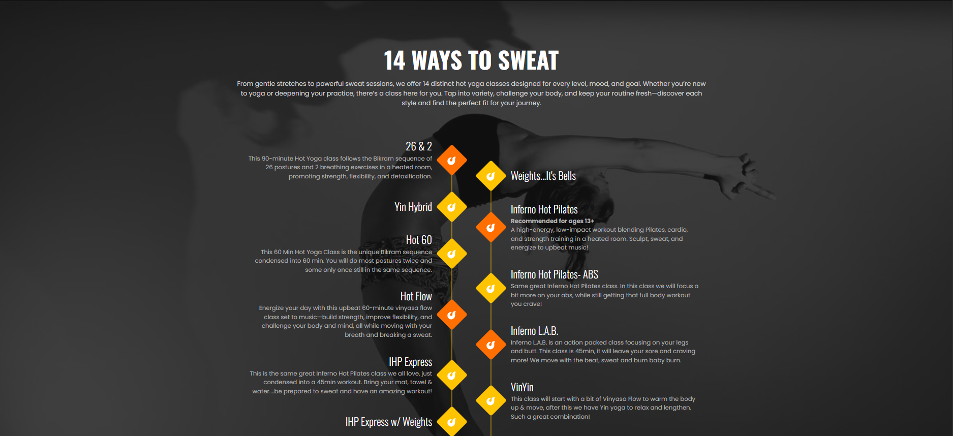
Navigation is now clean and intuitive, with clear calls-to-action such as Register Now, making it easy for visitors to take the next step. Key information like class types, pricing, and contact details are presented in well-structured sections that are easy to scan and understand.
The design uses strong contrast, consistent branding, and generous spacing, creating a polished and professional look that reflects a contemporary fitness brand. The overall experience feels more engaging, mobile-friendly, and conversion-focused, aligning with modern user expectations and supporting business growth.
You can check the live site here